Lunagram Studio · Brand & Web Design

Dear visitor,

…and hi, James!

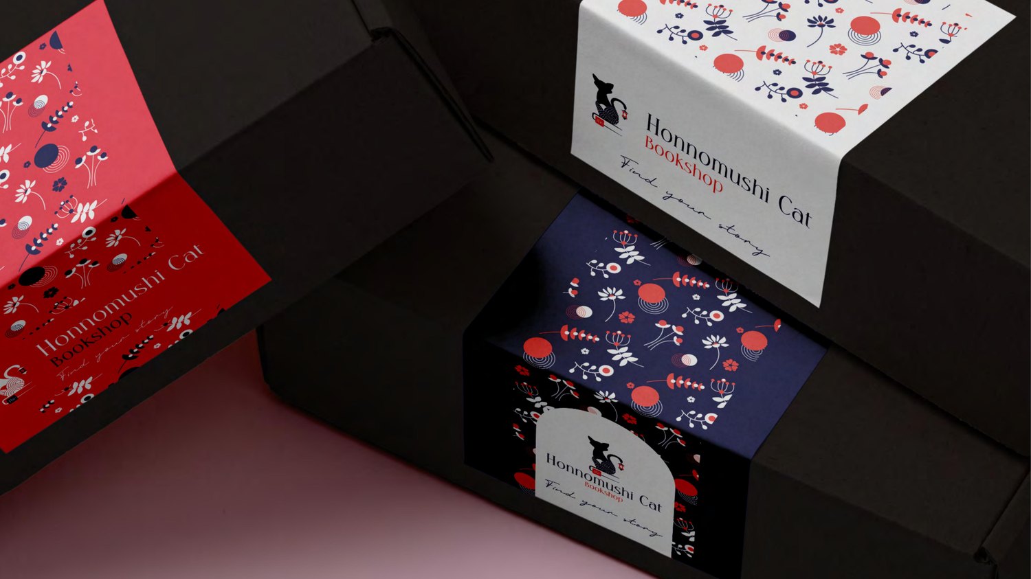
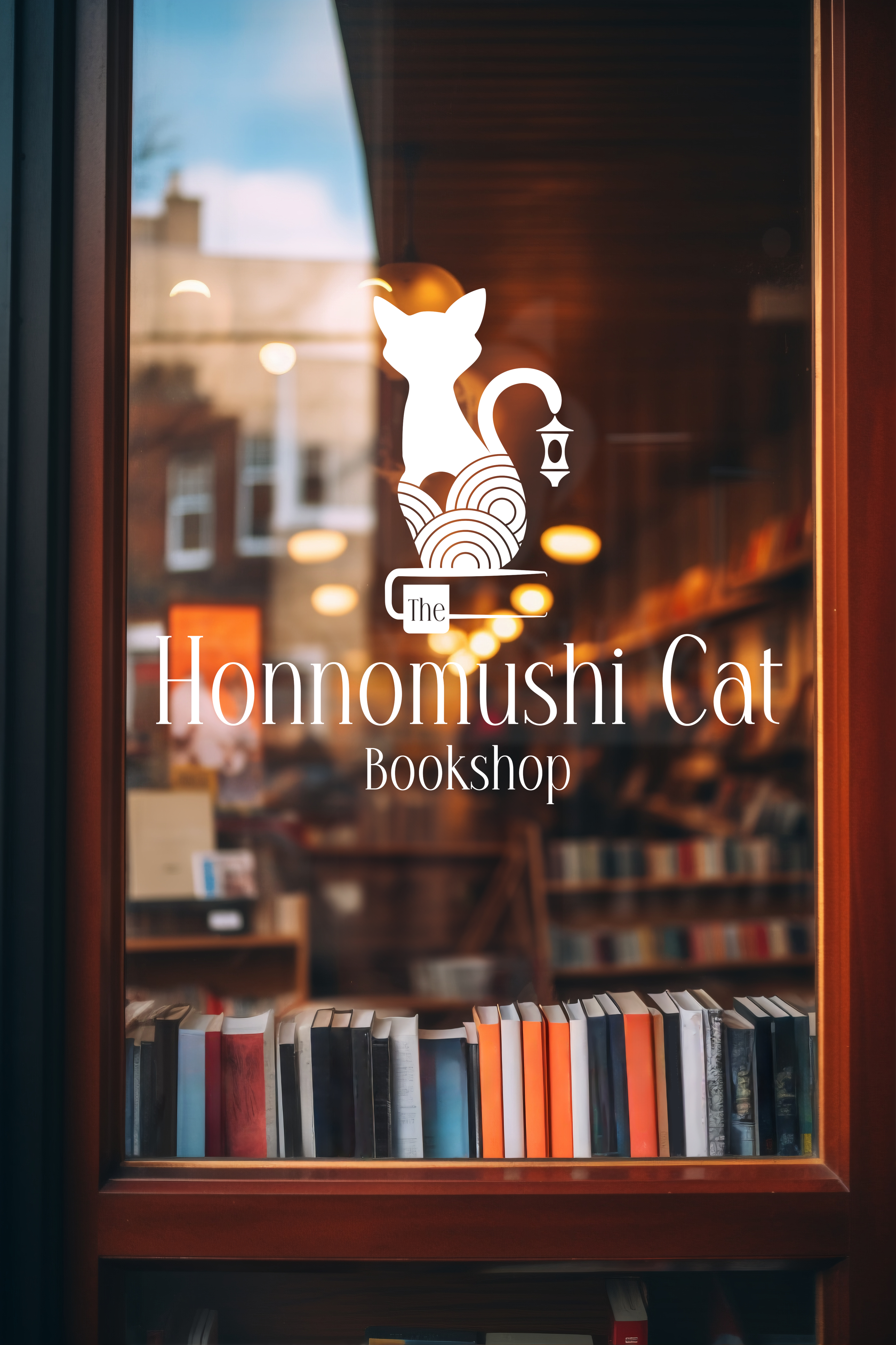
I'm Juli, a brand and web designer focused on thoughtful identities, clean layouts, and websites with real personality. I'm interested in building complete brand worlds — spaces where the business, the message, and the audience feel connected through clarity and trust. I made this page to walk you through one selected project in more detail, with a few glimpses of other work. Have a look around.

Juli — founder of Lunagram Studio
Scroll

Selected work

A full brand, carried all the way into code.

Welcome to

Honnomushi Cat Bookshop

A Japanese–Korean bookshop with the soul of a cosy English reading room.

Role
Brand Identity · Web Design · Custom Theme
Project
Japanese–Korean online bookshop
Scope
Identity → UX/UI → WooCommerce
Client
UK-based
Scroll

The starting point.

Anna wanted to create an online bookshop for Japanese and Korean literature, manga, and carefully selected stories — but not as a generic webshop or a cold minimalist catalogue. The heart of the brief was the atmosphere: the shop needed to feel both culturally inspired and deeply welcoming.

It had to carry Japanese and Korean references, while also giving visitors the warmth of a cosy English bookshop — familiar, calm, personal, and easy to spend time in. My challenge was to bring these worlds together without turning the identity into a cliché — magical, bookish, and characterful, yet elegant, grown-up, and usable as a real online shop.

Honnomushi Cat Bookshop packaging — Find your story
About the client — Anna, founder of Honnomushi Cat

A curator of quiet magic.

Anna is a curator at heart — someone drawn to careful, deliberately chosen things. She wasn't building a catalogue; she was creating a place where readers could feel at home among stories from another world. One specific challenge shaped the whole shop experience: Anna sells both new and preloved copies, which means a single title can exist in dozens of editions. The solution was a custom variation system on the product page — one item, all its versions, presented clearly and without friction.

This was never meant to be just a shop — but a sanctuary for stories and story-lovers, cat-people, and gentle wanderers.

A guardian, not a mascot.

One of the key wishes in the brief was that a cat had to be part of the identity. Instead of treating it as a cute mascot, I gave it a deeper role in the brand world: the cat became a quiet guardian of the bookshop — a guiding presence with a sense of mystery, warmth, and protection.

Inside the symbol, the layered circular pattern represents the way stories become part of us. As readers enter Japanese and Korean worlds through books, they leave traces — shaping our imagination and the way we see things. I wanted the logo to suggest that opening a book is not just an act of reading, but a small crossing into another world.

The system was designed to work across different uses — from the full bookshop identity to smaller marks, dark backgrounds, packaging details, and digital shop elements.

One identity, two moods
Light Dark
Honnomushi Cat Bookshop — primary logo
Primary
Honnomushi Cat Bookshop — symbol mark
Symbol
Honnomushi Cat Bookshop — horizontal lockup
Horizontal

Past the obvious black, white and red.

The goal was to move beyond the expected colour trio and create a softer, more distinctive palette — one that could hold both East Asian-inspired clarity and soft intimacy. Tap a swatch to copy its hex.

Copied
Deep Sea Blue
The depth of stories, night shelves, and deep magic.
#1D1E56
Copied
Soft Pink
A gentle layer of intimacy, softness, and calm.
#FDE9F4
Copied
Kind Red
A warmer take on iconic red — energetic, but not harsh.
#F1392C
Copied
Paper
A soft, breathable base for the brand.
#FDF4F8

This pair replaces the traditional black & white — the new, soul-filled contrast of the brand.

The geometric bloom.

Anna was drawn to the charm of English botanical ornamentation, but the brand needed something cleaner and more restrained than a traditional floral pattern. My task was to translate that rich, decorative inspiration into a motif system that could still feel bookish, warm, and elegant — without becoming busy or overly vintage.

I reimagined the floral elements as subtle geometric forms: simplified stems, rounded blooms, and rhythmic lines that could work across the identity, packaging, website sections, and background textures. The result keeps a trace of English bookshop ornament, but gives it a calmer, more structured visual language that fits the Japanese and Korean literary character of the brand.

From motif to rhythm.

Once the floral elements were simplified, I developed them into a repeatable pattern system that brings texture and movement into the brand — a rich surface for packaging, social posts, bookmarks, and textured website details, without overpowering the content.

Honnomushi Cat bookmarks showing the pattern system, resting on a book

The system, out in the world.

After defining the logo, colours, motifs, and pattern language, I extended the identity into social templates and small digital brand details. The goal was to make each post feel like part of the Honnomushi world — recognisable, immersive, and consistent, without becoming repetitive.

The same visual language carries across profile details, story highlights, post layouts, and decorative elements, so the brand feels curated wherever a reader meets it.

Iconography and social media assets

Designed, then built by hand.

For me, a brand doesn't stop at a logo, a colour palette, or a packaging mockup — it has to continue into the real experience, especially on a website, where people actually meet, explore, and decide. I believe an online shop doesn't need to pressure or manipulate people in order to work: it can guide gently, build trust, and still create a clear path from curiosity to purchase. That's why I carried the whole Honnomushi world into the site itself — the calm rhythm, the spirit of the brand, the character of the experience — built as a custom WordPress & WooCommerce theme, coded in PHP from the ground up, without a page builder.

Custom theme

A bespoke WordPress theme built in PHP, with component-based CSS, design tokens, inline SVG icons, and fluid typography — so the visual system could translate directly into code.

Real catalogue

Around 1,600 books and 740 authors structured with custom post types, taxonomies, and rich filtering by origin, genre, theme, condition, and format.

The buying path

A bookmark-shaped condition selector, masonry shop grid, custom cart and checkout, and UK shipping logic — shaping the full journey from browsing to buying.

~1,600
Products imported
740
Author profiles
0
Page builders used
Working preview

See it running live.

This is a real, working shop — not a mockup. You can browse the catalogue, open a book, test the filters, and explore the buying path.

The bookshop is currently available as a demo, with the move to its permanent home planned for the next few months. Until then, the preview is open to explore and test.

Enter the bookshop
Browse all books Books with cats About page The journal

Pacsni Bakery & Café — a warm brand with a hidden sun.

Pacsni is a Budapest artisan bakery and café built around a cream-and-chocolate palette, soft retro warmth, and a carefully handmade feeling. The owner wanted a sun in the logo — but without the obvious café-and-bakery clichés. So I hid that sunny feeling inside the pastry itself: in the seeds, the rounded centre, and the organic doughnut-like form.

A little easter egg, hidden in plain sight

The wordmark carries a small baking gesture too: the shape of the i was inspired by the movement of folded dough, making the logo feel friendly and handmade without becoming childish. That tiny dot then became a recurring brand detail across the Instagram highlight icons — the same instinct as the guardian cat hiding in Honnomushi: a small reward for paying attention.

Opening hours highlight icon with hidden doughnut dot Map highlight icon with hidden doughnut dot Pantry highlight icon with hidden doughnut dot Sale highlight icon with hidden doughnut dot Workshop highlight icon with hidden doughnut dot Breakfast highlight icon with hidden doughnut dot

Look for the little doughnut in each one.

Juli, brand & web designer

Design that doesn't stop at pretty.

I build brands around meaning, narrative, and the small details that make a visual language feel alive. I'm fascinated by connections — in design, and honestly in life too. I love finding the hidden thread between ideas that don't seem to belong together at first, then shaping them into something coherent, intentional, and useful.

For me, branding is world-building: mood, rhythm, symbols, and still moments people can connect with. Web design is one part of that process — a place where the brand can keep speaking instead of stopping at the moodboard. I'm based in Hungary and drawn to considered, human-centered brands with a story beneath the surface. And if there's room to hide a small easter egg, build a tiny universe, or let a cat quietly guard the whole thing — even better.

Thank you for taking a look.

I made this page to give you a focused view of how I think, build, and carry a brand identity from first idea to finished experience. I'd be grateful for any feedback or direction you feel would help me grow further — and if you see potential for a conversation beyond that, I'd be very happy to hear from you.

hello@lunagramstudio.hu